Much attention has been focused on the appearance of overhead power lines. These often run great distances with numerous support structures and their environmental impact can be huge.
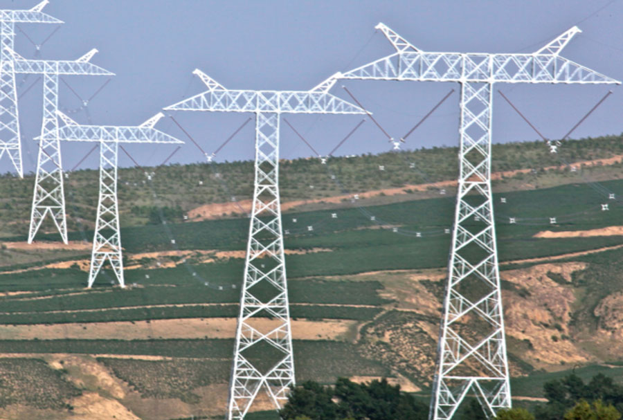
But what about power system nodes such as switching and transformer substations or converter stations? These occupy large tracts of land and are filled with structures and equipment that can also alter views and landscapes? Should aesthetics and visual impact play a role in their design as well? Or, is the better strategy to ensure these are sited as far from public view as possible? INMR presents several examples to illustrate how power supply utilities across the globe have dealt with this choice.
Most substations and converter stations have traditionally been designed around technical requirements, safety and cost. Appearance has not normally been a factor since these have typically been located in areas with limited public presence. The problem is that this situation can change over the life of a substation. Once unpopulated areas might grow into new residential subdivisions or commercial neighbourhoods. Eventually, substations can find themselves surrounded and a purely industrial appearance can make them the target of disapproval, objections and even vandalism.
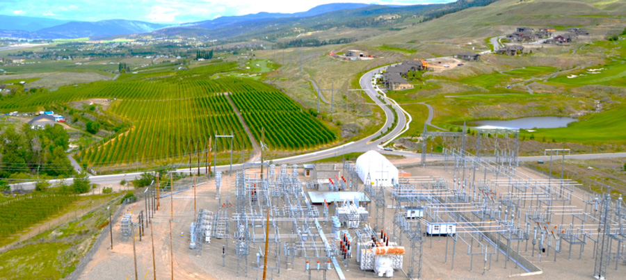
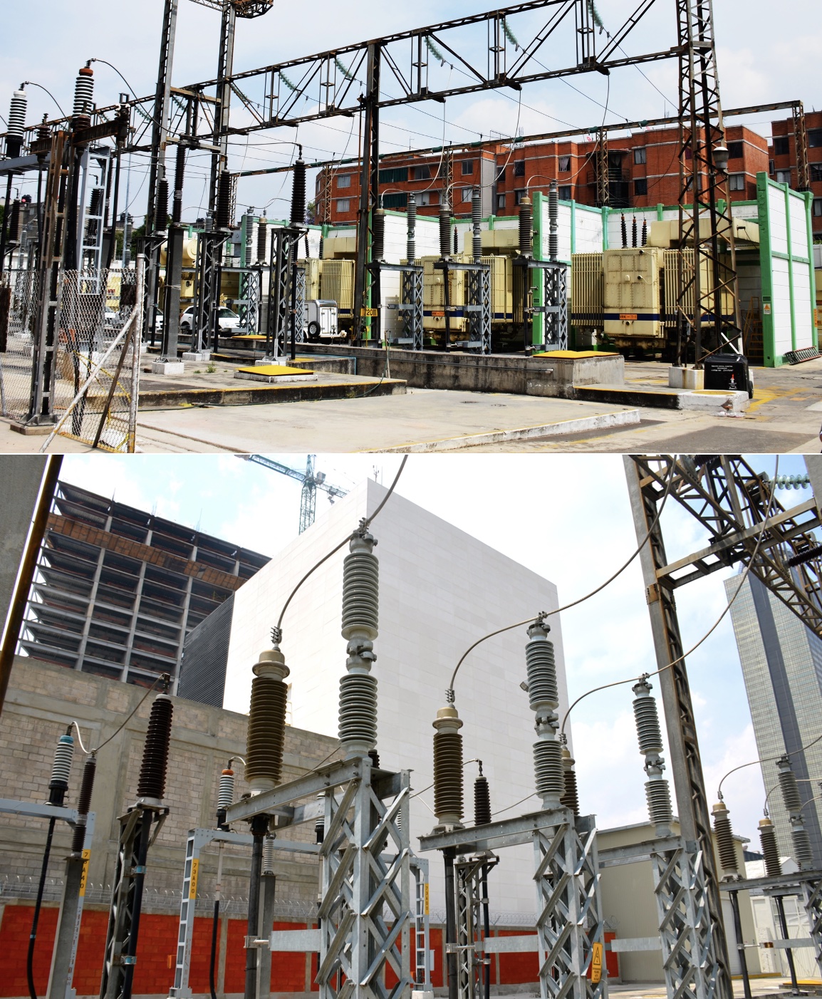
Appearance becomes more an issue whenever there are proposals for new substation projects in sensitive areas, these can be sited in topographical depressions that help shield them from public view or designed with minimal structure heights and reduced visual impact.
Another approach assumes that every substation will eventually become the object of public scrutiny. Therefore, to turn possible adversity to advantage, aesthetic designs or facades can help project a modern, progressive image for the power supply company that operates the station.
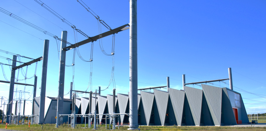
Over the years, INMR has visited substations worldwide and reviews some notable examples where appearance played a prominent role in design.
Substation in Seville, Spain
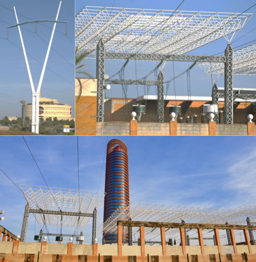
The 1992 World Fair in Seville focused on futuristic architecture and offered a unique opportunity for the local power utility to showcase design excellence in both towers and substations. Nearly 30 years later, these structures have retained their original appeal and have helped a large substation blend into an urban neighbourhood of high-rise contemporary buildings.
Substation near Helsinki, Finland
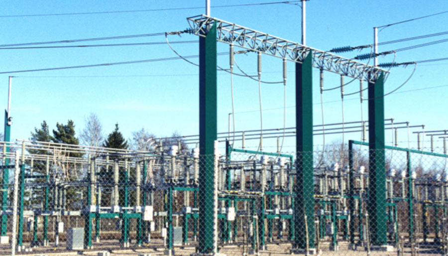
Finland is a country noted for avant garde design and architecture. For example, this tradition was applied in the early 1990s to three prominent transmission towers sited near a busy highway interchange but also to a substation near the country’s major international airport in Vantaa. The aim was to reduce the station’s visibility against the forested surroundings using green structural elements. By today’s standards this may not seem that progressive yet in the day it marked one of the power industry’s first acknowledgements that visual impact of a substation matters to those who live nearby or who pass it regularly on the highway.
Regentsville Substation in Australia
During the mid 1990s, the network operator in New South Wales wanted to build a classical mesh substation at the strategic confluence of existing 330 kV and 132 kV lines. The pristine region where the station was to be sited was the exact type of place where staunch resistance to a new air-insulated substation could be expected. The goal of station designers was therefore to create a layout that would help obtain public approvals without resorting to the costly alternative of a GIS solution.
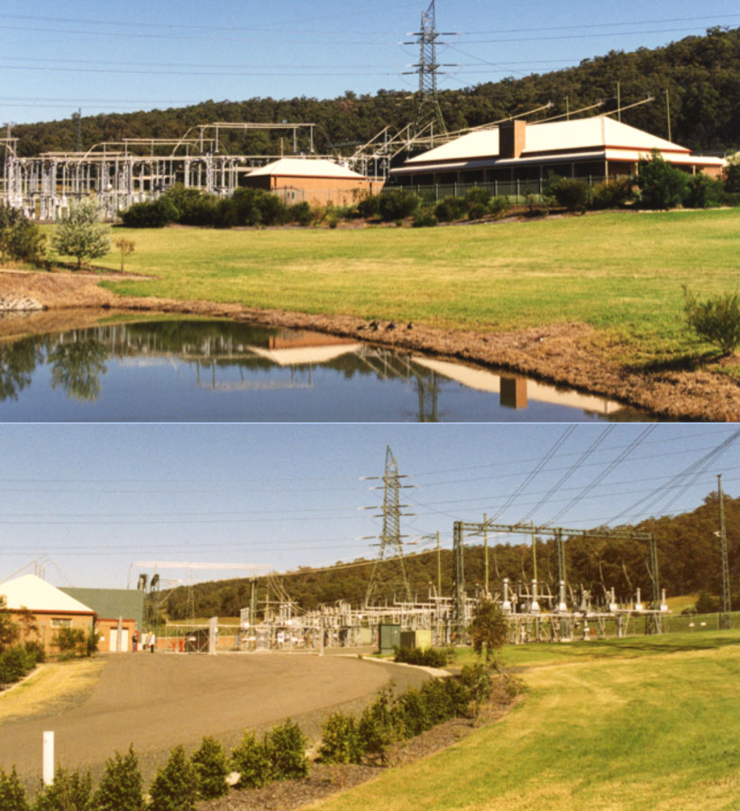
Since land surface was not an obstacle, this was achieved by controlling structure height in order to understate overall visual impact. Moreover, any structure above a certain height was painted green while incoming conductors were grit-blasted to remove sheen. Finally, a pond as well as buildings resembling a country club were added to give the entire substation a character fitting of the area’s history and local traditions.
Substation near Montreal, Canada
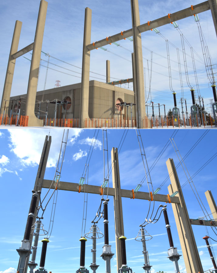
A key GIS substation located along one of the main highways connecting to downtown Montreal was designed around concrete structures and elements reminiscent of prominent other buildings along the route. This helped the facility to blend in rather stand out.
Substation in Mexico City
Veronica GIS substation in Mexico City lies between residential complexes and high-rise commercial buildings. Since most of the incoming feeders for the pre-existing GIS were oil and paper cable, this technology was converted to XLPE cable directly outside the structure to avoid presence of oil near the GIS. A recent retrofit project saw new incoming XLPE cable going directly to another GIS facility linked to two new 230/23 kV transformers.
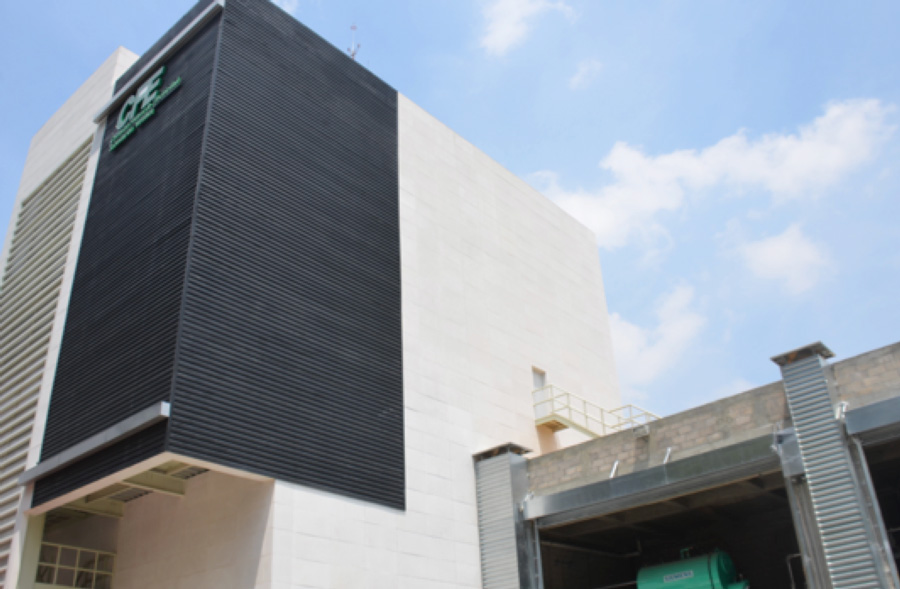
The showpiece of this latest refurbishment was an elegant but expensive structure which houses the 230 kV GIS equipment and which was designed to fit in among the modern buildings nearby. Part of the reason for the high cost was that it had to be engineered with special damping equipment to move as a single unit thereby protecting the GIS inside from any excessive movement and allowing it to remain operational even during earthquakes of magnitude 8 or more. The height of the new building reflects the land constraint since it houses not only the GIS on one floor but also the metal-clad switchgear directly above it on an upper floor.
Converter Station in Italy
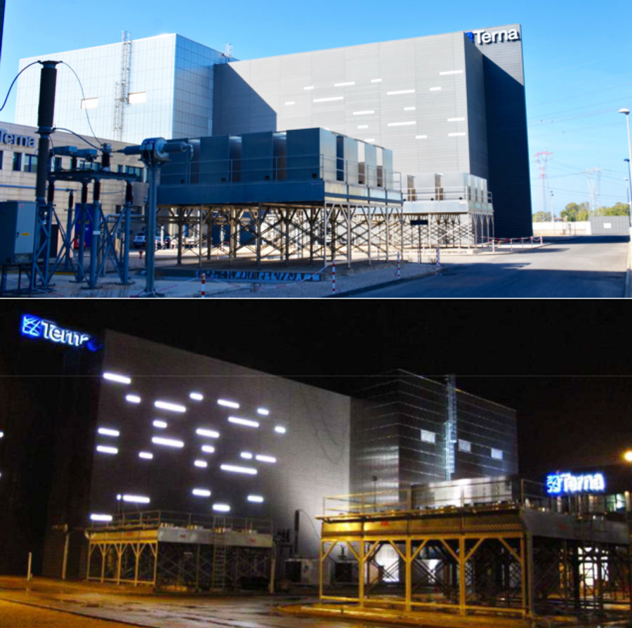
The ±500 kV SAPEI Converter Substation is located near the town of Latina in central Italy. The complex, which includes a 380 kV air-insulated substation and switchyard, filters, valve halls and fully enclosed DC halls is bordered on one side by the sea and a 1000 MW cable connection to the island of Sardinia. The other side faces a much-travelled coastal highway serving touristic areas.
Due to its massive scale, maintaining low visual impact was not an option. Instead, the station’s architectural cover aimed to project a futuristic facade complete with nighttime light show.
GIS Substation in Belgium
The double circuit 380 kV line that transports power between the substation in Zeebrugge and the Horta Substation near Zomergem was not the type of project that might normally attract attention. Yet with only 100 towers and covering but 37 km of overhead line along with 10 km of underground cable, it became among the most watched projects in Europe. What made the project so interesting is that it served as an example of how a power utility can adapt to meet the challenges now faced by most in the industry – from helping respond to climate change to successfully dealing with opposition to new lines and substations. In this context, the processes and solutions adopted offered a unique opportunity to study how these challenges can be approached.
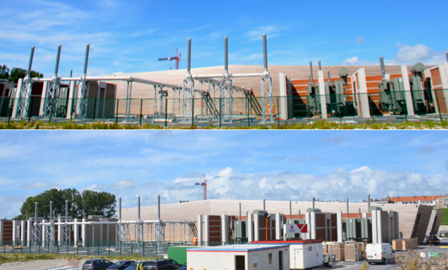
The project terminates at the substation in the coastal city of Zeebrugge where a uniquely designed GIS substation was sited at a low point near a highway overpass to reduce visual impact. Notwithstanding, it has a low sweeping design using a wooden facade that resembles a ship. As at other substations on this project, GIL technology was utilized to reduce distances between incoming phases and also allow for a smaller overall ‘footprint’.
Cable Termination Station in Denmark
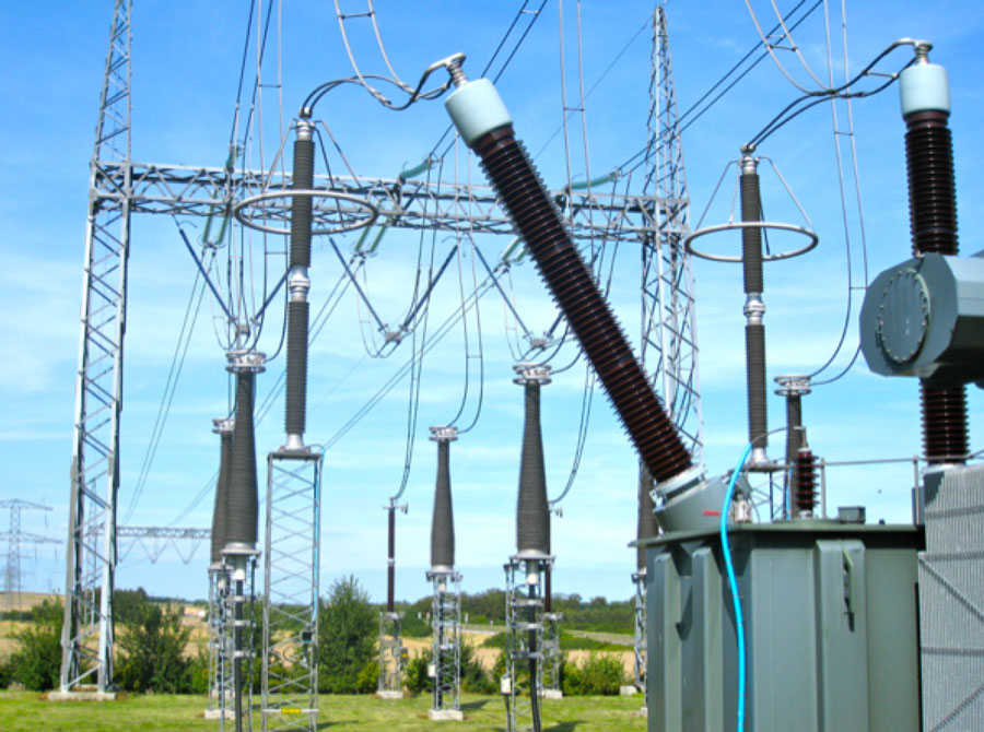
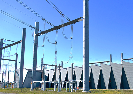
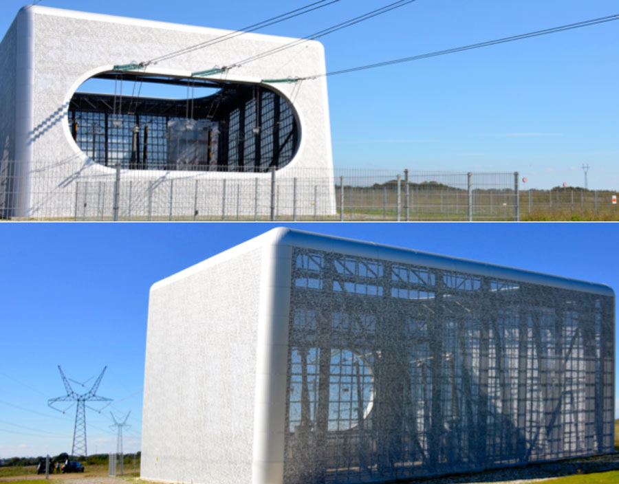
A cable transition station has substantial visual impact, especially given that these are often sited at sensitive points where overhead lines are not accepted. With this in mind, Danish TSO, Energinet, created a futuristic metallic enclosure to house a new cable transition station that replaces the decommissioned overhead line crossing of the sea separating this area from the rest of Denmark.
[inline_ad_block]

